It was an honor to be part of the home of millions of Brazilians, share their concerns, and chase an ambitious goal: cut costs and generate more revenue.
Client
Tele Sena (Capitalização division leadership)
Role
End-to-end UX
Period
Feb 2025 – Aug 2026
Product Design
Figma
UX Research
Prototyping
Usability testing
Design System
Data-informed UX
Applied AI
WCAG Accessibility
Situation
Tele Sena is one of Brazil's most traditional products and had already been working well for decades, but the support team spent a lot of time helping customers check draw results and redeem their winnings.
Task
As the product's sole UX, I needed to improve the product's numbers: spend less and generate more revenue.
Action
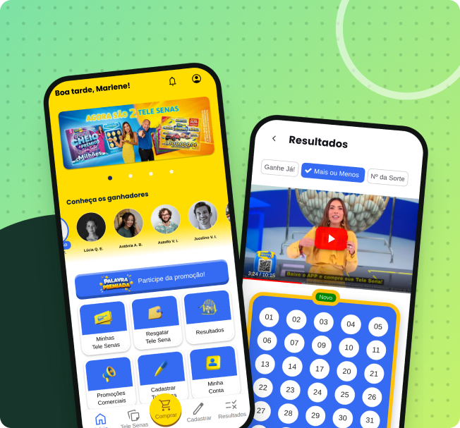
I listened to every area of the company, including the CEO, reorganized the redemption and results flows, and created the Palavra Premiada (Prize Word) promotion.
Result
18% fewer calls about results
8% fewer calls about redemption
Sales growth from the "Palavra Premiada" promotion
18%
fewer calls about results.
People were buying tickets but didn't know if they'd won. I put the information where they were already looking for it.
8%
fewer calls about redemption.
I removed what wasn't necessary and added a button with the question people already had in mind: how do I redeem my money.
14%
of Tele Sena sales now come from the Weekly draw, thanks to Palavra Premiada
After Palavra Premiada launched, Tele Sena Semanal (Weekly) went from 8.9% (average of the 4 typical weeks before, excluding the Christmas/New Year seasonal spikes) to 13.8% (11-week average after) of total Tele Sena sales.
01 · The invitation
Improving something that's already worked for decades.
Working at Tele Sena means being part of Brazilian history: a traditional product, present in millions of households for decades. When e-commerce brought me in to improve the numbers — spend less, sell more — I took it on for the challenge: it's not about building from scratch, it's about improving something that already works. I joined as the company's sole UX; the team grew afterward.
02 · The research
Everyone pointed to the same place.
I started by listening to the whole company — directors, managers, the CEO — asking where they saw opportunity in flow and process. Everyone pointed to the same place: redemption and checking results. I went to support, who gave me the numbers:
30%of calls: understanding the ticket's result
25%of calls: redemption flow
My goal was to create a path where customers could do this on their own. Anyone who still wanted to call would keep being helped.
03 · How I worked
One UX, many devs, and one rule: clarity.
Sole UX in an already-consolidated architecture, I chose targeted, safe improvements over redesigning from scratch, reusing the existing design system. I asked customers where they struggled, confirmed it with support, and reorganized the flow:
Reused existing components
Reordered information around what people are looking for
Cut questions people didn't need to answer
Made the state of everything explicit
04 · Solution · Results
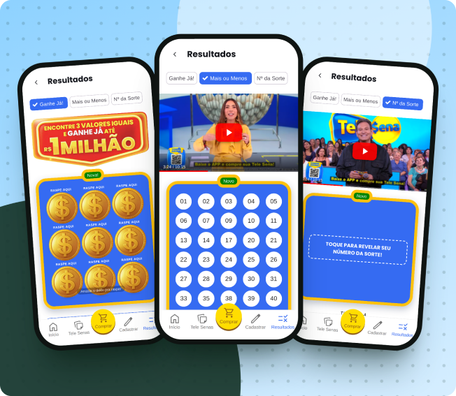
Won or lost? You can tell at a glance.
Anyone who opens the screen wants to know one thing: did they win. I put the answer right up front, with no ambiguity, even during the live draw.
18%fewer support calls
05 · Solution · Redemption
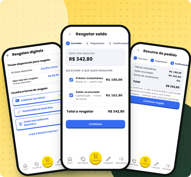
Redeeming money without fear of getting it wrong.
People who want their money back look for exactly that on the screen. I reduced the flow to the essentials and added a button with the question already on people's minds: how do I redeem my money. Fewer questions, clearer steps, fewer errors.
8%fewer support calls
06 · Solution · Palavra Premiada
A weekly mechanic that gives people a reason to come back.
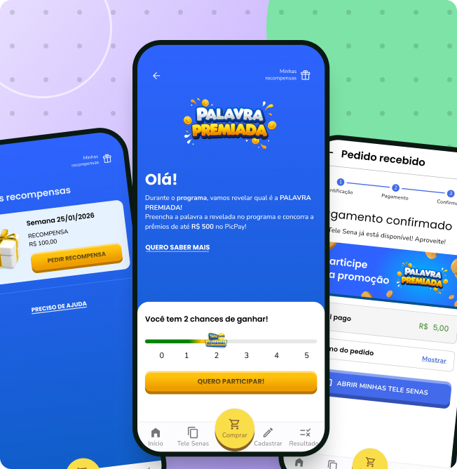
I created Palavra Premiada (Prize Word): every week a word is revealed on the TV show, and whoever types it correctly in the app enters to win prizes. A simple, playful layer that connects TV to digital and gives people a recurring reason to open the app.
14% of Tele Sena sales13.8% of sales on average after launch (before: 8.9%)
Tele Sena Semanal's share of sales
By week, from Dec 7, 2025 to Apr 5, 2026
8.9%average before launch (4 typical weeks)
13.8%average after launch (11 weeks)
Dec 7, 2025: 7.3% of sales
Dec 14, 2025: 10.2% of sales
Dec 21, 2025: 9.6% of sales
Dec 28, 2025: 12.9% of sales
Jan 4, 2026: 12.9% of sales
Jan 11, 2026: 8.7% of sales
Jan 18, 2026: 13.2% of sales — the week the experience (campaign and app) went live
Jan 25, 2026: 14.7% of sales
Feb 1, 2026: 15.8% of sales — peak of the period
Feb 8, 2026: 14.6% of sales
Feb 15, 2026: 10.4% of sales
Feb 22, 2026: 13.2% of sales
Mar 1, 2026: 13.2% of sales
Mar 8, 2026: 14.2% of sales
Mar 15, 2026: 13.9% of sales
Mar 22, 2026: 14.3% of sales
Apr 5, 2026: 13.9% of sales
20%10%0%
Launch Jan 187.3%15.8%
DecJanFebMarApr
Share = Tele Sena Semanal sales ÷ total Tele Sena sales. Each point is one week. The weeks of Dec 28 and Jan 4 (Christmas and New Year seasonal spikes, which recur every year) are excluded from the "before" average — the average is the simple average of the other 4 typical weeks in that phase. Source: internal sales data.
In the 4 typical weeks before launch, Tele Sena Semanal averaged 8.9% of sales — excluding Dec 28 and Jan 4, which are classic Christmas/New Year seasonal spikes, not campaign-driven. In the 11 weeks after (from Jan 18), it rose to 13.8%. The promotion has been regulated since Nov 30, 2025; Jan 18 is when the experience (campaign and app) went live.
07 · Takeaways
Simplicity beats sophistication.
For people with less digital confidence, simple beats sophisticated.
Microinteractions and horizontal scroll create friction, not delight.
Strong technical constraints lead to better decisions.
I learned to prioritize real impact over aesthetics. This was my last project at Tele Sena.
08 · In short
Fewer support calls. More Weekly draw sales.
18%
fewer calls about results.
People were buying tickets but didn't know if they'd won. I put the information where they were already looking for it.
8%
fewer calls about redemption.
The flow asked for too much. I removed what wasn't necessary and added a button with the question already on people's minds: how do I redeem my money.
14%
of Tele Sena sales come from the Weekly draw (before: 10%)
Weekly average: 8.9% in the 4 typical weeks before (excluding Christmas/New Year seasonal spikes) and 13.8% in the 11 weeks after launch (Jan 18).
Fewer people calling support, more people buying. It came down to flow adjustments and a lightweight game idea, without reworking the design system.
Approximate figures, provided by the support team (no formal report). Sales: internal Tele Sena data, product team's own breakdown.
Testimonial
“I had the opportunity to work with Erick during the time he was part of my team, acting as a UX/UI specialist. We always had a very good professional relationship, with plenty of exchange and day-to-day collaboration. Erick is a professional committed to his deliverables, open to feedback, and skilled at working across different areas. During the time we worked together, he contributed to several digital projects, bringing his UX/UI perspective to building and improving experiences. It was great to share this professional period with him, and I wish him lots of success in his next challenges!”
Liked it? Let's talk.
Feedback, criticism or a proposal: reach out, it's always worth the conversation.